


FORD
WOMEN WHO MOVE AMERICA FORWARD
Recognize and Celebrate
Women Who Move America Forward
ROLE
UX/UI DESIGNER
VISUAL DESIGNER
THE TEAM
1 UX/UI DESIGNER
3 COPYWRITERS
3 CREATIVES
TIMELINE
1 MONTH

We launched Women Who Power America Forward, a campaign aligned with Ford’s Built for America brand initiative. It celebrates the women who are building, shaping, and driving our country forward. This multi-faceted campaign spanned multiple social platforms, podcast integrations, and a LinkedIn panel, featuring over 250 pieces of content. Remarkably, it was created, produced, and launched during the global pandemic by an almost entirely female team. This site was created in 2020 during
the pandemic, and it was my first time using awesome Figma.


I had the privilege of leading the design for the Women Who Power America Forward website and its social media components. It’s especially rewarding when my coworkers notice how my passion for design shines through, particularly in impactful projects like this one for the women of Ford.
They even asked me to create the logo for the project.
Color Palette

Ford has been defined by its iconic blue for over 121 years. In this campaign, we aimed to inspire each woman featured to embrace her own unique color, just as she embodies her one-of-a-kind personality. Ford blue served as the anchor, while bright accent colors highlighted each woman's individuality, allowing her to stand out in her own way.
Typography
Roboto
Characters
A B C D E F G H I J K L M N O P Q R S T U V W X Y Z
a b c d e f g h i j k l m n o p q r s t u v w x y z
0123456789! # $ % % / ( ) @ = ?, . –
Thin Bold Italic
Aa
I used Roboto for the layout and designed the logo with the classic Ford font, maintaining
brand consistency as much as possible until the developers took over my files.
Figuring out the formula
Once I had the formula figured out, I paired each incredible woman with a color that best represented
her career. The connections were clear and fitting.

Queen of course is Red for Fire
Raquel is Green for Greenhouse
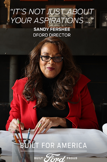
Sandy is Purple for ambition
Adrienne is blue to represent water

I incorporated this design at the end of each webpage, allowing viewers to scroll through and explore each story.
Designed these playful-shaped buttons, with the white arrow appearing to invade the button, adding a fun touch to the online social advertising. It brought some colorfulness to the Ford's rich blue.


A great example of giving each woman her own unique color is Raquel, whose video features a subtle green outline for a fun touch. It brings out the vibe of her personality!

Love how it gave Queen's page a bold, fierce energy. When I designed the quotes over a black-and-white image, the client loved it so much they requested Pinterest posts to showcase powerful quotes while promoting Ford.


Here are examples of some of these Pinterest ads.